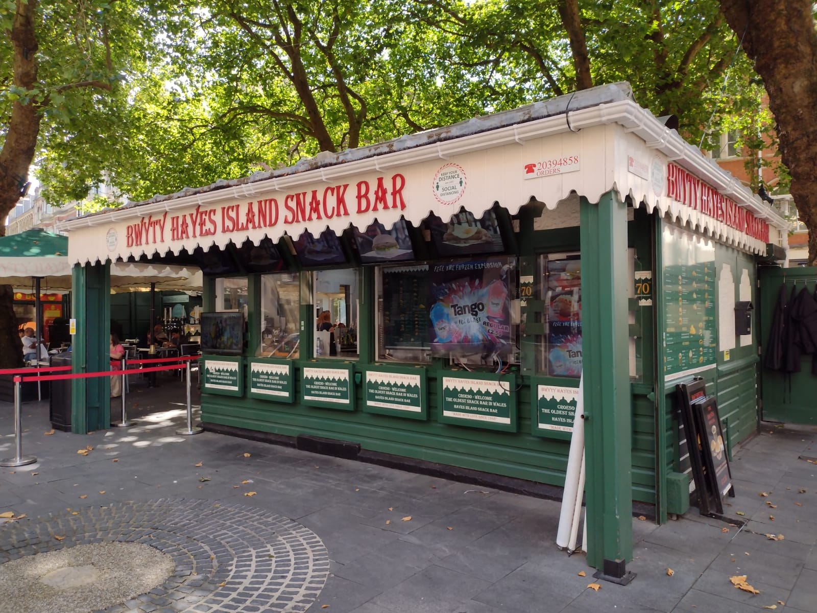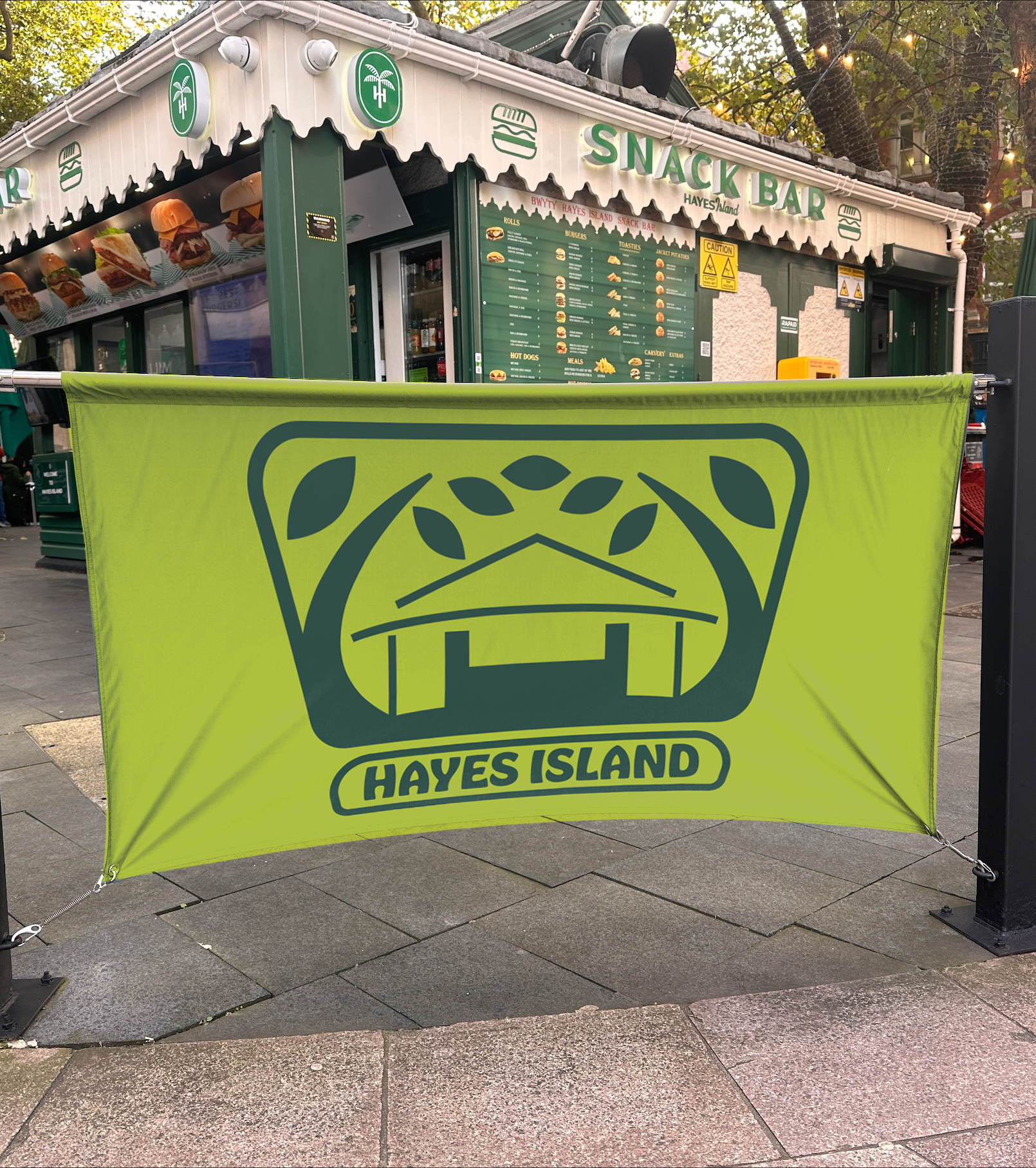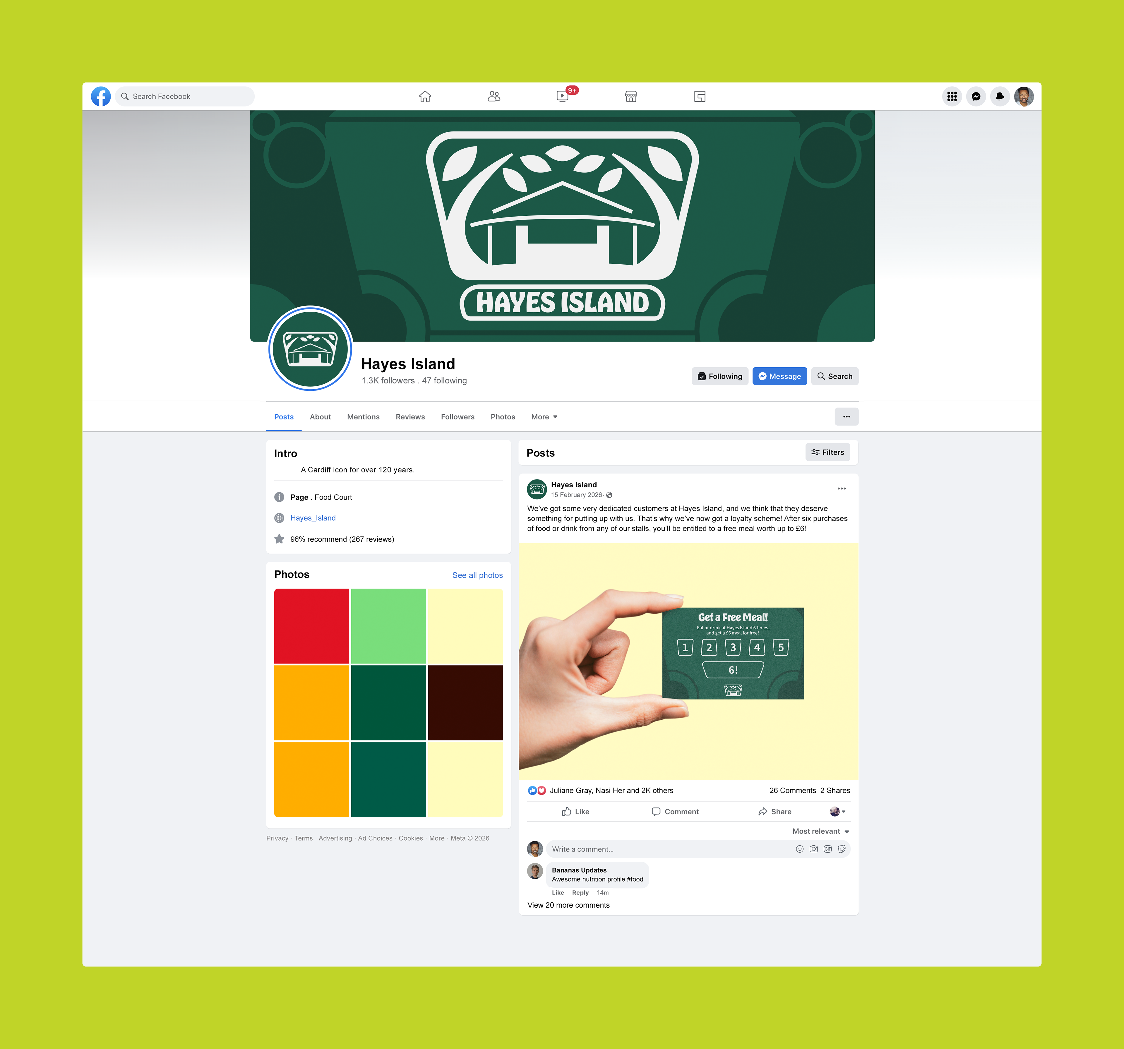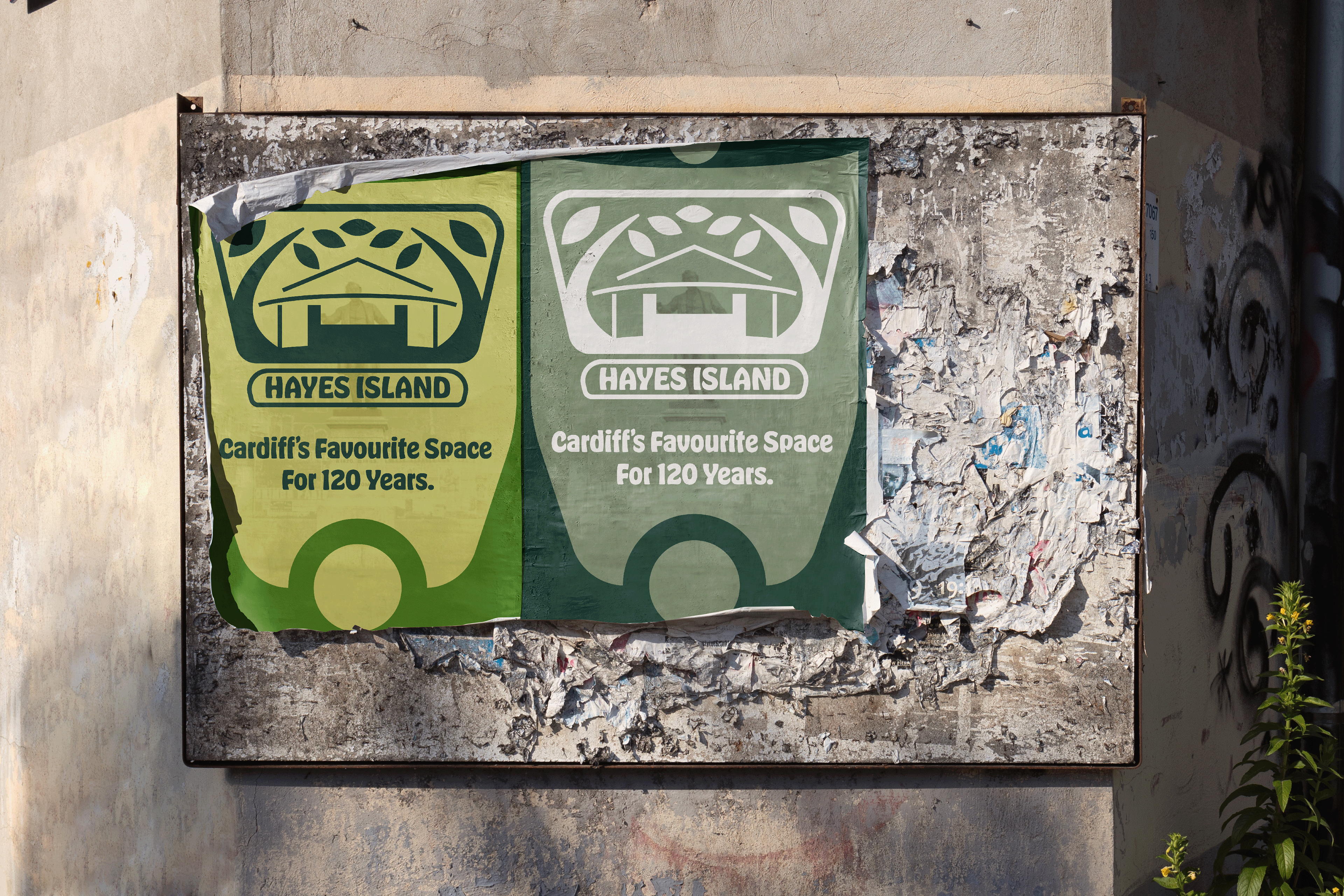
A theoretical rebranding project. I looked at Hayes Island, a central cafe and communal area in the centre of Cardiff, which has history dating back to the 1890s. I wanted to incorporate elements from designs of the time while still abiding to current design sensibilities. The trapezoid shape of the logo comes from the floor plan of the site, and the hut / trees are also based on important physical aspects of the square.
The site is centred around a hut built as a parcel depot in 1911, which is its unique selling point. As such, I looked at posters and prints of the time, which were primarily of the art nouveau movement, and adapted their sinuous type and illustrative flourishes.